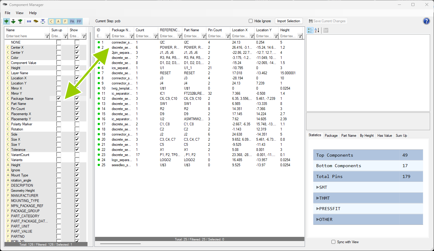

The Component Manager displays all informations that a component possible can have. You can quickly get an overview how many components have certain attributes or if any component have a height that is not possible. Predefined views make it easy to export Excel files that fit your needs.

You can configure the view that you see on the right (2) by selecting the wanted attributes and properties on the left side (1).
The Left Side is called the Property List while the right side is called the Component List
The properties selected on the left side will then show up on the right side. The order of the columns is determined by the order in which you have selected the properties in the listview on the right. If you want to change the order you can also drag and drop the different columns to the position you want. Important to note is that columns like id, reference and the SumUp Column will be moved back to the front after you reopen the Component Manager. Sum Up will add the different rows together and aggregate the rows based on the selected values.
The different icons inside of the Property List define what kind of attribute it is, while the dot besides the component in the Component List shows the change status of the component. The legend for the different icons is as follows.

You can select multiple different settings to adjust the view quickly.
![]()
From left to right they to the following.
By right clicking the component list you can export the current view to and Excel or HTML file.

Items selected inside of the Component List can be edited inside of the property grid on the right side.

Any changes to the component will lead to the green dot turning orange. You can save the changes by either clicking the button above the property grid and saving or pressing the save option in "File" in the top row. Until then there are no changes that are actually saved and applied to the real components. If you select multiple components at the same time, or use the Sum Up which leads to a row representing more than one component, the property grid will show you only the values that are the same between all components. Any changes inside of the property grid will then edit all objects at the same time. Properties shown are not necessarly present in all components selected. If one component has the property then the property will be shown. If a value is then edited, the components that do not have the property will be given the property.
There are multiple statistics about the design that can be easily viewed in the lower right hand corner.
In total there are 6 different statistics that can easily be accessed inside of the different tabs.
The first tab shows the amount of top and bottom components that populate the board as well as the amount of pins on the board. Furthermore you can see the statistics also divided depending on the mounting type of the component.

The next tab shows the different packages that are used and how often they are used. Starting from this statistic you can choose between a bar chart or a pie chart with the radio buttons below the chart.


The next tab does the exact same just sorted by the Part Name instead of the Package.
The height tab looks at the different Heihgts that are present in the design and displays them.
The tab called "Has Value" inspects how many components have a certain property. You are able to select the different properties and find out if for example all components have a "MPN" property.
The Sum up Tab does the exact same as the sum up function inside of the Property List, but in the form of a bar or pie chart.